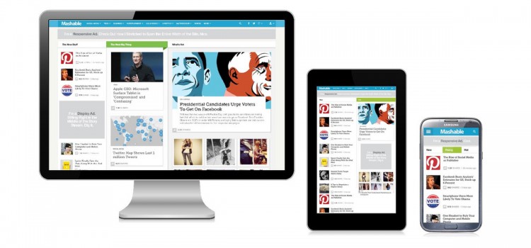
Web designers and clients are starting to appreciate the importance of making sure that Web pages and emails can be read on many different devices.
Responsive Design Takes Over the Web!


Web designers and clients are starting to appreciate the importance of making sure that Web pages and emails can be read on many different devices.
If you started your mobile Web project from scratch today, with no knowledge of how the mobile Web differs from the desktop Web, you’d spend months chasing down strange bugs and figuring out how to create some bit of consistency between different devices.
If you knew just one trick, you could reduce this debugging time to weeks.
In early April, Google announced that they are leaving the WebKit family to start their own browser engine, called Blink. So, Google messed everything up, but in a good way!