Description
Whether you’re a graphic artist, a photographer, a painter, or a maker, you need an online gallery of your work. Today, it’s not enough to have just any gallery — it needs to work (and look good) on any smartphone, tablet, laptop, or desktop computer.
Making web sites that adjust to different sized screens is called responsive design, or RWD.
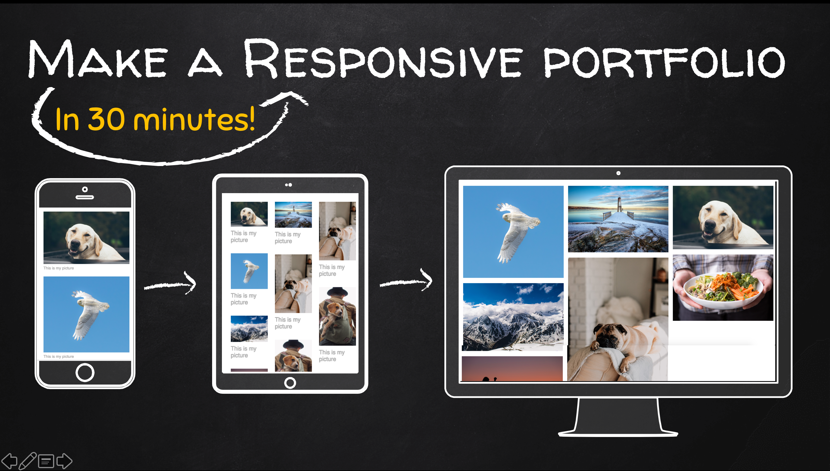
In this class, you’ll use CSS3 Flexbox and responsive image techniques to create an image gallery that displays 3 columns of images on large screens and automatically adjusts image sizes and the number of columns to fit smaller screens.
This is a great beginner project for anyone who is new to Flexbox, and at the end of this short class you’ll have a professional image gallery and the basic code for recreating this gallery with your own images.


